OrientationObservationIn-depth interviewsDocument analysis and semiologyConversation and discourse analysisSecondary Data
SurveysExperimentsEthicsResearch outcomes
Conclusion
8.4.1.2 Graphical representation Frequency tables can also be presented in diagrammatic form. A bar chart, histogram or pie chart can sometimes represent the data in a more accessible or easily understood way than the frequency table.
The choice of diagram or table in the final report is primarily about what makes the report most readable. It is, however, inadvisable to present all the data in the same diagrammatic way. A report full of pie charts, however colourful they may be, is just as boring as one that has endless frequency tables.
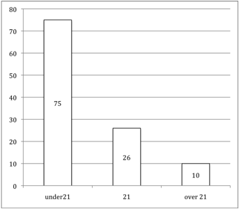
Figure 8.4.1.2.1, is the vertical bar chart for the data on consenting age for men with the data grouped into three categories, below 21, 21 and above 21 (See Table 8.4.1.1.3 for non-grouped data) and it shows at a glance what are the popular ages of consent. However, it doesn't include missing or percentage data, which may or may not be important in the report, depending on what one infers about the missing responses (see discussion in Section 8.4.1.1).
Figure 8.4.1.2.1: Consenting age for men (grouped data)
Activity 8.3.12.1
Compile the frequency table for the age of consent for women (V21) and draw a vertical bar chart to represent the table. Use a computerised graphics pack if you have access to one. How else might the data be represented graphically?
It is important, however, to note that there is no point in including tables or diagrams in a report without analysing what they mean and showing how they relate to your hypotheses. Do not fill your report up with tables and diagrams and hope that somehow they speak for themselves. Without some commentary they are a waste of space.
For more details on different types of graphical representation of statistics see, for example, economicsdiscussion.net(accessed 28 April 2020).